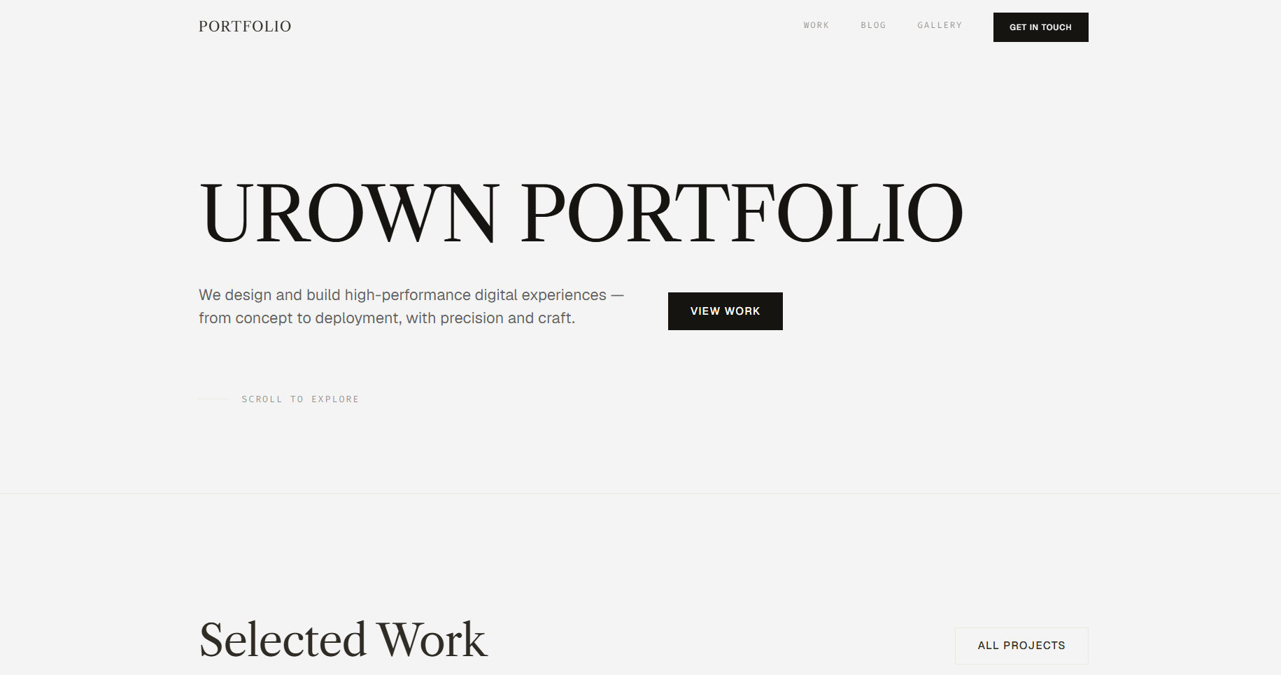
A refined portfolio website template for designers, creative professionals, and independent studios, built to present selected work, share ideas, and establish a distinctive creative presence. The editorial layout combines projects, personal information, journal entries, and visual references into a structured portfolio experience. All content can be managed through a connected CMS without editing the code.
Product description
A single-page editorial portfolio website with dedicated pages for projects and journal posts. It is designed for visual designers, art directors, creative developers, photographers, and independent creatives who want a polished online presence centered around their work.
The homepage is organized into carefully spaced sections for selected projects, an about profile, professional experience, education, journal entries, and a visual archive. The restrained typography, generous whitespace, and dark contrast sections give the website a sophisticated editorial character while keeping the focus on the content.
Content such as project information, images, biography, experience, journal posts, and visual archive items can be managed through a connected CMS. You can update your portfolio from a web-based dashboard without modifying the source code.
Key features
- Editorial hero section. A large typographic introduction immediately communicates your creative identity and establishes a strong visual first impression.
- Selected work showcase. Highlight your most important projects in a clean two-column grid with large imagery and concise project titles. A separate Works archive provides access to the complete collection.
- About Me section. Introduces your background through a profile image, biography, professional experience, and education. The dark background creates a strong visual transition from the main portfolio section.
- Experience & education timeline. Present your professional background, previous roles, and educational history in a structured editorial layout that is easy to scan.
- Journal section. Share articles, thoughts, processes, and creative insights through a minimal list-based journal layout. Each post can be opened as an individual article.
- Visual archive. Display photography, references, experiments, or personal visual collections in a compact image grid. The section provides a secondary space for work that does not belong in the main project archive.
- Project detail pages. Give individual projects their own dedicated page where you can present project descriptions, imagery, process, and additional information.
- Blog / journal detail pages. Each article has its own reading experience with structured typography and editorial spacing.
- Strong typographic hierarchy. Large serif headlines, small uppercase labels, restrained navigation, and generous whitespace create a refined editorial aesthetic.
- Dark contrast sections. Selected sections use a near-black background to create visual rhythm and separate personal information from the main portfolio content.
- Contact call-to-action. A dedicated closing section encourages visitors to start a conversation or discuss a potential project through a simple contact button.
- Responsive layout. The editorial grid and typography adapt across desktop, tablet, and mobile screen sizes while maintaining the visual hierarchy.
- CMS-driven content. Projects, journal posts, visual archive items, profile information, experience, education, and other editable content can be managed through the connected CMS without changing the code.
Pages included
- Home — Hero, selected works, about, experience, education, journal, visual archive, and contact CTA.
- Works — Complete project archive.
- Works detail — Individual project / case study page.
- Journal — Complete article archive.
- Journal post — Individual article page.
- Visual Archive — Collection of personal or creative visual references.
- Studio — CMS dashboard for managing portfolio content.
Design style
Minimal and editorial, with an off-white background, near-black typography, and subtle neutral tones. Large serif headlines create a sophisticated magazine-inspired character, while small uppercase labels and restrained sans-serif text provide structure and hierarchy.
The layout uses generous whitespace, thin dividers, asymmetric spacing, and carefully proportioned image grids to create a calm and premium visual experience. A full-width dark section introduces contrast around the About area, while the final CTA uses a warm neutral background to create a distinct closing moment.
The overall design is intentionally restrained, allowing the work, typography, photography, and personal identity to become the primary visual elements.